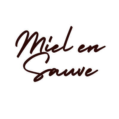
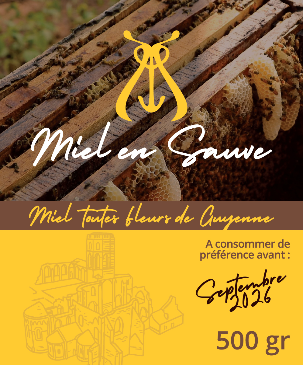
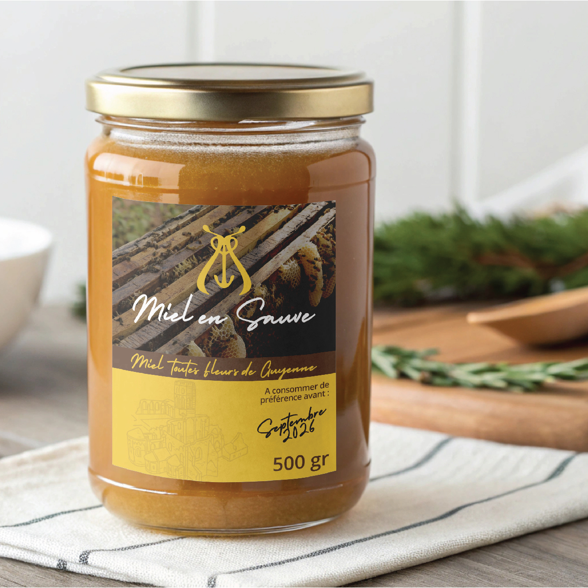
MIEL EN SAUVE Visual Identity
Naturally sincere
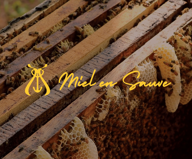
Rooted in the village of La Sauve, Miel en Sauve celebrates the authenticity of a raw and precious product: honey.
Harvested locally and patiently, with deep respect for nature and time, this honey embodies a craft that is both humble and enduring.
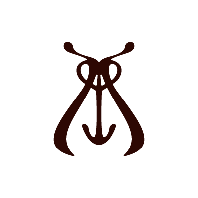
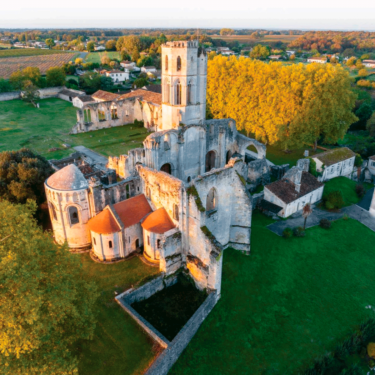
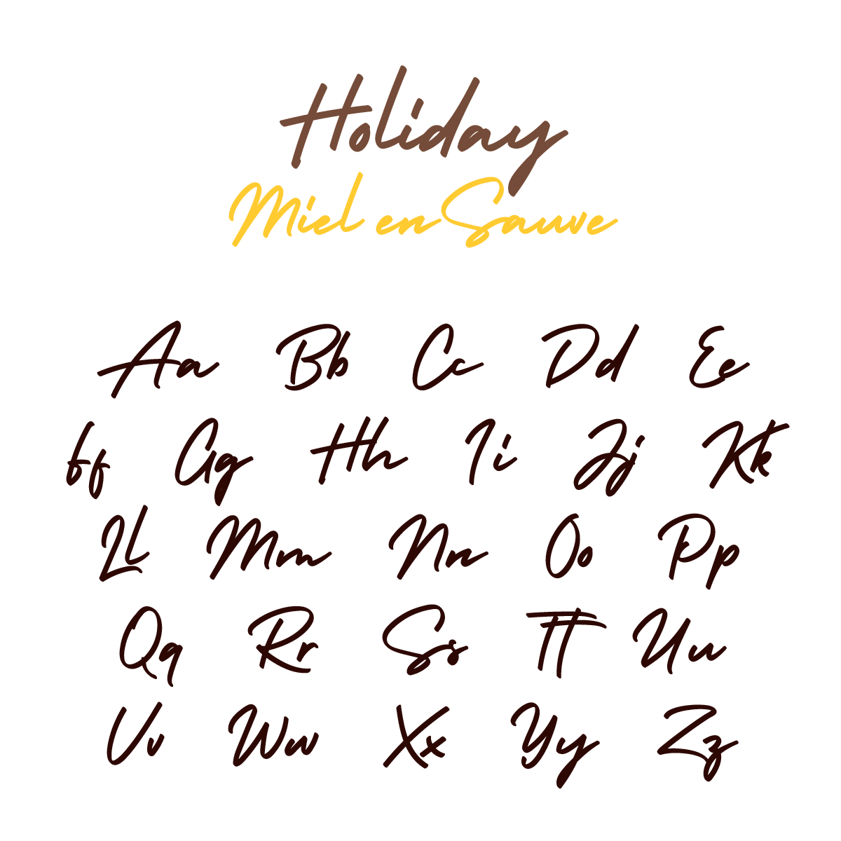
Miel en Sauve speaks with quiet clarity and purpose.Its visual identity reflects this philosophy: a handwritten typeface with warmth, a natural palette inspired by earth, wood, and golden light, and a symbol that pays tribute to the village abbey’s heritage.
Far from the polished tactics of modern marketing, Miel en Sauve offers a return to what matters most.An honest product.
A timeless aesthetic.
A story that’s local, grounded, and true.Miel en Sauve is the art of turning patience and nature into pure sweetness.Honey with a story and a soul.